When making improvements to a product or a service, it’s crucial to understand what the people you’re designing for are already doing — whether you’re working on software or a public transit network.
At Remix, we commonly do that by interviewing our customers. For cities and transit agencies, one of the many ways they learn about existing behaviors is by evaluating ridership data. That’s why, after learning from planners, we’ve added interactive ridership data to Remix. This makes it quick and easy to learn where riders are boarding and exiting a transit line.
Once an agency has sent us their ridership data, anyone in their organization can start to analyze the usage patterns of transit lines in their network. Planners can break down ridership information by time of day, day of the week, and the directionality of each line. You can also dive deeper and get detailed numbers of how many passengers, on average, are boarding or exiting at each stop. Having this information in Remix allows you to quickly turn learnings from data into planning decisions.

Every week, hundreds of planners use Remix to design and evaluate changes to their city’s transit network. Naturally, this means we hear many requests for new features. While it can be tempting to take these requests and start building something right away, it’s important for us to first understand them better. As a product team, it’s our job to learn about the underlying problems and challenges beneath these requests, and to get perspectives from across the variety of agencies who work with us.
We knew ridership data was important, but we also realized there was a lot we didn’t know. What do the words “ridership data” mean for different people? How are planners analyzing the data, and how does that inform their planning decisions? And, perhaps most importantly, how can we make this process better?
To get some answers, we set up video chats with transit planners from a number of cities. We talked to folks at agencies of all sizes, including those working in the U.S. and internationally.
After chatting a bit about who they were and what they were working on, we dove into their process. We had the planners walk us through how they use ridership data: how they get access to it, what it looks like, what they learn from it, and what kinds of changes they make to their network based on it. We also shared a few examples of ridership data visualizations to see what resonated most with them.
We found that planners were using ridership data for a number of reasons:

From our conversations, we identified the hardest parts of this process. At many agencies, there’s often only one or two people who can develop reports on ridership data. This creates a process where planners need to make requests every time they want a different cut of the data — like a different time of day — and the analyst spends a lot of time dealing with these requests. We also found that some planners are limited by time or technical skill and can’t create the kinds of visualizations that would be most useful to them.
We realized that as a software company, we could use our strengths to save planners and analysts a lot of time and provide more in-depth ridership visualizations. After synthesizing our learnings, we regrouped and evaluated what a ridership feature in Remix should include:
If you’re a planner working with Remix and want to be able to use the features we’ve talked about here, get in touch! Your customer success manager will get you all the details you need to get your agency’s boarding and alighting data into Remix.
Questions or feedback? Please reach out at [email protected] or [email protected].

Introducing On-demand Planning: The first planning product for on-demand and flexible fleets that is data-driven, integrated with the fixed-route network, and collaborative.

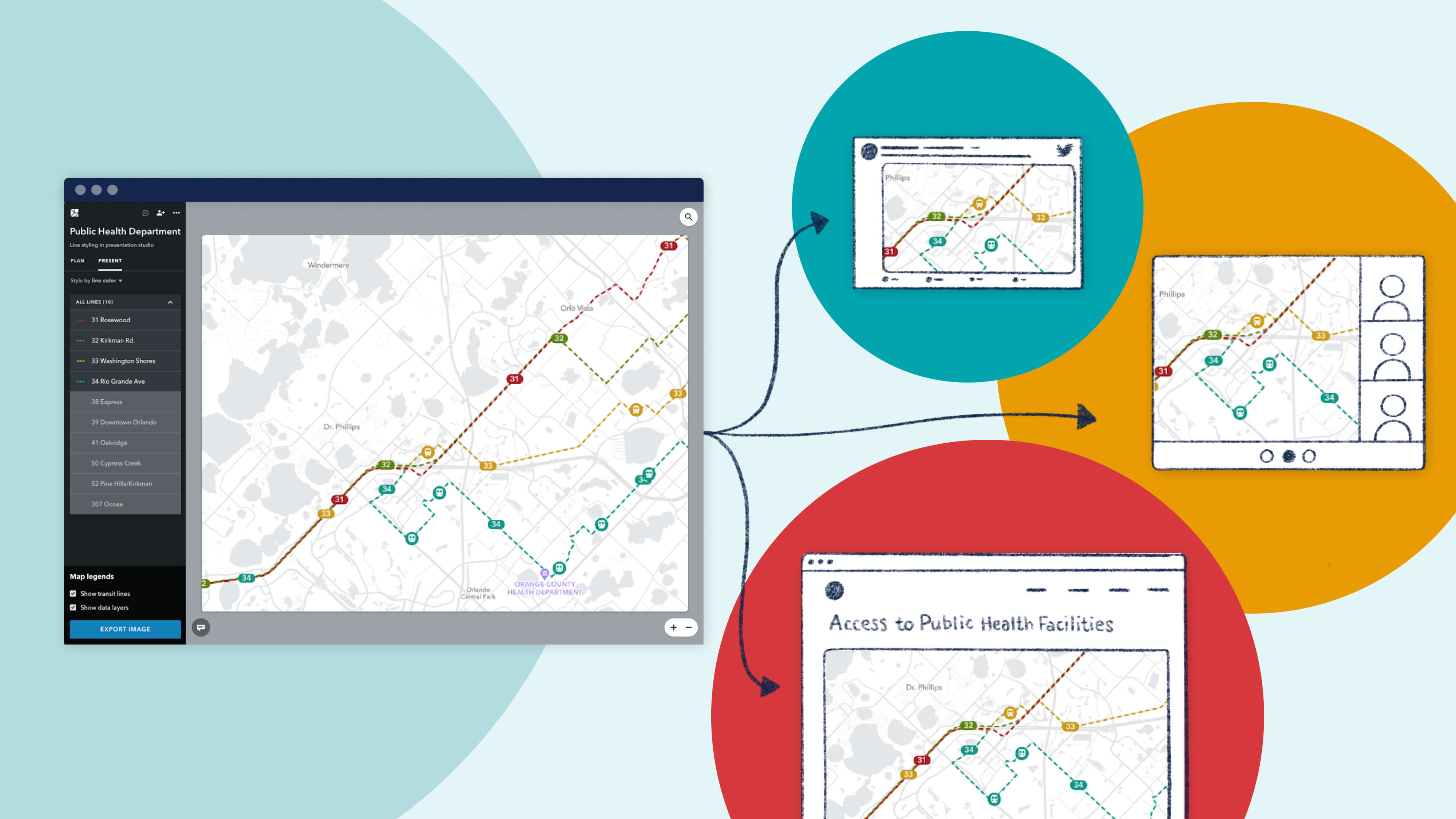
Meet New Remix, designed to be more intuitive, flexible, and more powerfully multimodal.
Since launching Presentation Studio, we’ve been delighted to see the creative ways in which our partner agencies are using the feature. We're proud to showcase their work with a "Map Gallery."

